|
|
本帖最后由 wangyaqian10910 于 2012-12-19 21:11 编辑
今天在论坛里看到一个帖子《R语言画图大全,非常实用,需要文章画图的看过来了》【地址:http://www.biostatistic.net/thread-2636-1-1.html】,讲得很好,可惜没有相关的配图,现将相关图片添加上。语言方面,就不再翻译了。
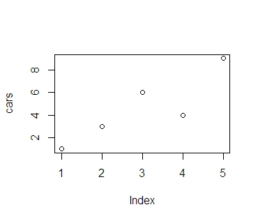
First we'll produce a very simple graph using the values in the car vector: # Define the cars vector with 5 values
cars <- c(1, 3, 6, 4, 9)
# Graph the cars vector with all defaults
plot(cars)
简单散点图
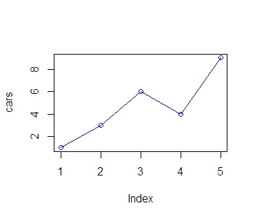
Let's add a title, a line to connect the points, and some color: # Define the cars vector with 5 values
cars <- c(1, 3, 6, 4, 9)
# Graph cars using blue points overlayed by a line
plot(cars, type="o", col="blue")
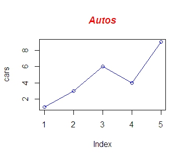
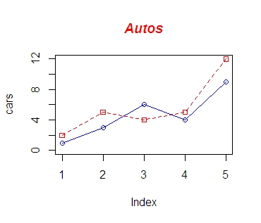
# Create a title with a red, bold/italic font
title(main="Autos", col.main="red", font.main=4)
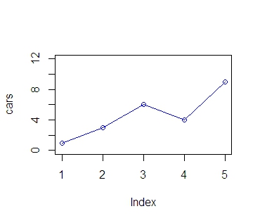
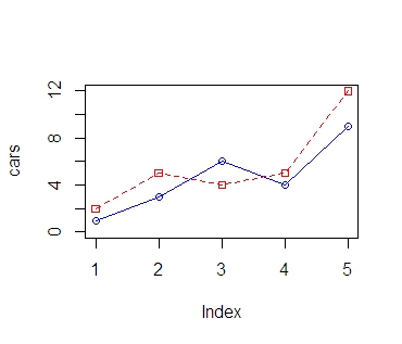
Now let's add a red line for trucks and specify the y-axis range directly so it will be large enough to fit the truck data: # Define 2 vectors
cars <- c(1, 3, 6, 4, 9)
trucks <- c(2, 5, 4, 5, 12)
# Graph cars using a y axis that ranges from 0 to 12
plot(cars, type="o", col="blue", ylim=c(0,12))
# Graph trucks with red dashed line and square points
lines(trucks, type="o", pch=22, lty=2, col="red")
# Create a title with a red, bold/italic font
title(main="Autos", col.main="red", font.main=4)
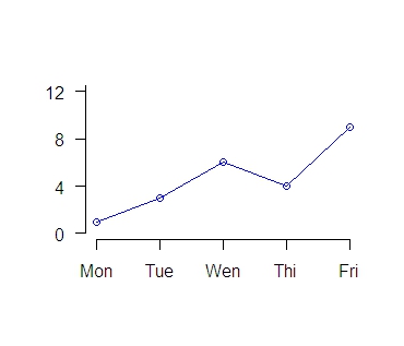
Next let's change the axes labels to match our data and add a legend. We'll also compute the y-axis values using the max function so any changes to our data will be automatically reflected in our graph.
# Define 2 vectors
cars <- c(1, 3, 6, 4, 9)
trucks <- c(2, 5, 4, 5, 12)
# Calculate range from 0 to max value of cars and trucks
g_range <- range(0, cars, trucks)
# Graph autos using y axis that ranges from 0 to max
# value in cars or trucks vector. Turn off axes and
# annotations (axis labels) so we can specify them ourself
plot(cars, type="o", col="blue", ylim=g_range,
axes=FALSE, ann=FALSE)

# Make x axis using Mon-Fri labels
axis(1, at=1:5, lab=c("Mon","Tue","Wed","Thu","Fri"))
# Make y axis with horizontal labels that display ticks at
# every 4 marks. 4*0:g_range[2] is equivalent to c(0,4,8,12).
axis(2, las=1, at=4*0:g_range[2])
# Create box around plot
box()
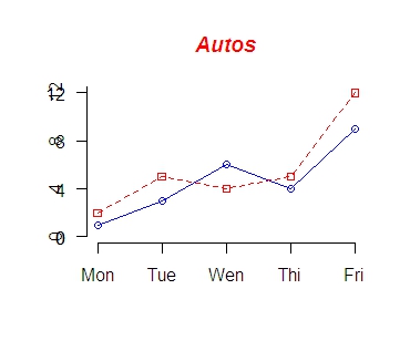
# Graph trucks with red dashed line and square points
lines(trucks, type="o", pch=22, lty=2, col="red")
# Create a title with a red, bold/italic font
title(main="Autos", col.main="red", font.main=4)
# Label the x and y axes with dark green text
title(xlab="Days", col.lab=rgb(0,0.5,0))
title(ylab="Total", col.lab=rgb(0,0.5,0))
# Create a legend at (1, g_range[2]) that is slightly smaller
# (cex) and uses the same line colors and points used by
# the actual plots
legend(1, g_range[2], c("cars","trucks"), cex=0.8,
col=c("blue","red"), pch=21:22, lty=1:2);
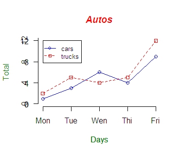
Now let's read the graph data directly from a tab-delimited file. The file contains an additional set of values for SUVs. We'll save the file in the C:/R directory (you'll use a different path if not using Windows). autos.dat
cars trucks suvs
1 2 4
3 5 4
6 4 6
4 5 6
9 12 16
We'll also use a vector for storing the colors to be used in our graph so if we want to change the colors later on, there's only one place in the file that needs to be modified. Finally we'll send the figure directly to a PNG file.
# Read car and truck values from tab-delimited autos.dat
autos_data <- read.table("C:/R/autos.dat", header=T, sep="\t")
# Compute the largest y value used in the data (or we could
# just use range again)
max_y <- max(autos_data)
# Define colors to be used for cars, trucks, suvs
plot_colors <- c("blue","red","forestgreen")
# Start PNG device driver to save output to figure.png
png(filename="C:/R/figure.png", height=295, width=300,
bg="white")
# Graph autos using y axis that ranges from 0 to max_y.
# Turn off axes and annotations (axis labels) so we can
# specify them ourself
plot(autos_data$cars, type="o", col=plot_colors[1],
ylim=c(0,max_y), axes=FALSE, ann=FALSE)
# Make x axis using Mon-Fri labels
axis(1, at=1:5, lab=c("Mon", "Tue", "Wed", "Thu", "Fri"))
# Make y axis with horizontal labels that display ticks at
# every 4 marks. 4*0:max_y is equivalent to c(0,4,8,12).
axis(2, las=1, at=4*0:max_y)
# Create box around plot
box()
# Graph trucks with red dashed line and square points
lines(autos_data$trucks, type="o", pch=22, lty=2,
col=plot_colors[2])
# Graph suvs with green dotted line and diamond points
lines(autos_data$suvs, type="o", pch=23, lty=3,
col=plot_colors[3])
# Create a title with a red, bold/italic font
title(main="Autos", col.main="red", font.main=4)
# Label the x and y axes with dark green text
title(xlab= "Days", col.lab=rgb(0,0.5,0))
title(ylab= "Total", col.lab=rgb(0,0.5,0))
# Create a legend at (1, max_y) that is slightly smaller
# (cex) and uses the same line colors and points used by
# the actual plots
legend(1, max_y, names(autos_data), cex=0.8, col=plot_colors,
pch=21:23, lty=1:3);
# Turn off device driver (to flush output to png)
dev.off()
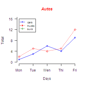
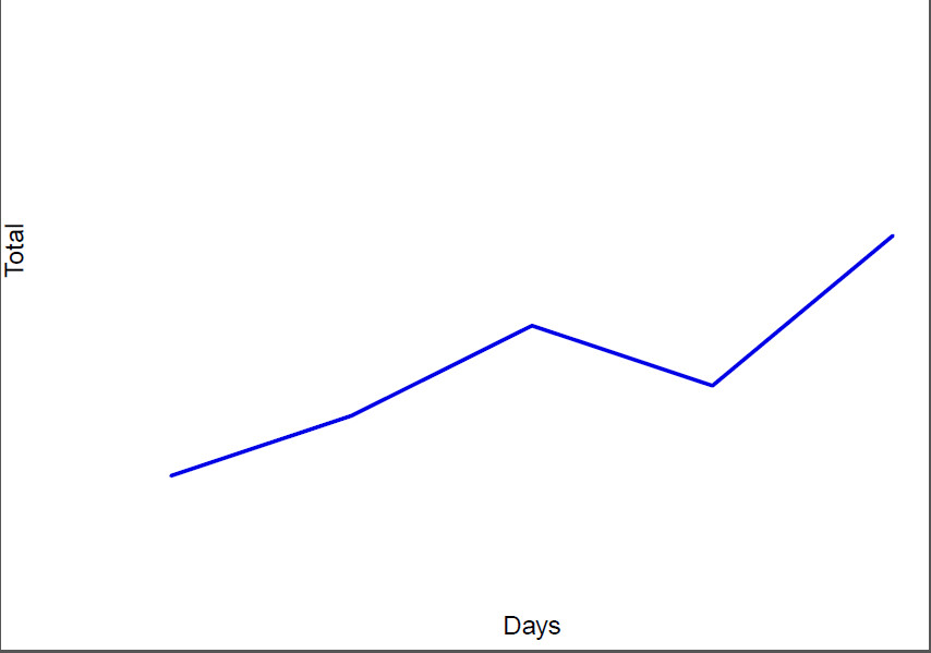
In this next example, we'll save the file to a PDF and chop off extra white space around the graph; this is useful when wanting to use figures in LaTeX. We'll also increase the line widths, shrink the axis font size, and tilt the x-axis labels by 45 degrees.
# Read car and truck values from tab-delimited autos.dat
autos_data <- read.table("C:/R/autos.dat", header=T, sep="\t")
# Define colors to be used for cars, trucks, suvs
plot_colors <- c(rgb(r=0.0,g=0.0,b=0.9), "red", "forestgreen")
# Start PDF device driver to save output to figure.pdf
pdf(file="C:/R/figure.pdf", height=3.5, width=5)
# Trim off excess margin space (bottom, left, top, right)
par(mar=c(4.2, 3.8, 0.2, 0.2))
# Graph autos using a y axis that uses the full range of value
# in autos_data. Label axes with smaller font and use larger
# line widths.
plot(autos_data$cars, type="l", col=plot_colors[1],
ylim=range(autos_data), axes=F, ann=T, xlab="Days",
ylab="Total", cex.lab=0.8, lwd=2)
|
|